In this section we look at some utility functions as well as the “quick plot” function, qplot.
9.1 Axes: Quick Functions
In general it is best to use the scale_* functions when modifying axes. However there are a number of utility functions that can be used as an alternative:
xlab
ylab
xlim
ylim
Each of these functions has a single, self-explanatory purpose. But here’s an example anyway:
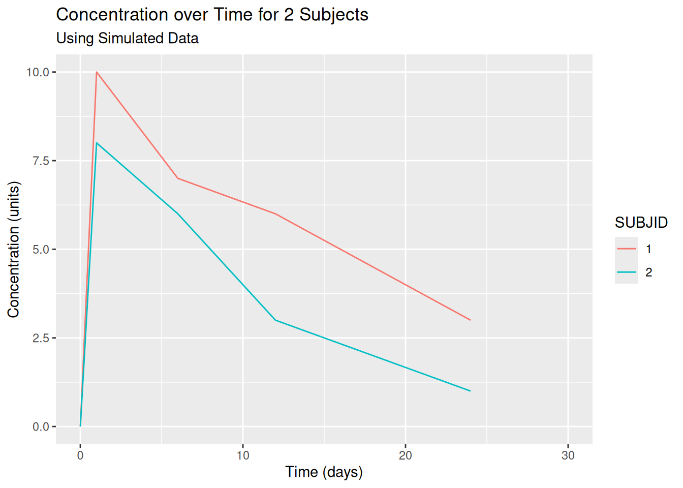
my_plot <-ggplot(data = pk,aes(x = TIME, y = CONC, colour = SUBJID)) +geom_line()my_plot +ggtitle("Concentration over Time for 2 Subjects",subtitle ="Using Simulated Data") +xlab("Time (days)") +ylab("Concentration (units)") +# *lim functions require a vector of lower and upper limitsxlim(c(0, 30)) +ylim(c(0, NA)) # No upper limit defined, use data
9.2 The qplot Function
The ggplot function provides a consistent framework from which to create high quality customised graphics. However the syntax can be a little verbose when all that’s required is a simple scatter plot. For this very reason, the qplot function exists! The “q” in “qplot” stands for quick. The aim is to enable us to quickly explore data without having to write huge amounts of code. The usage is much like R’s base plot function.
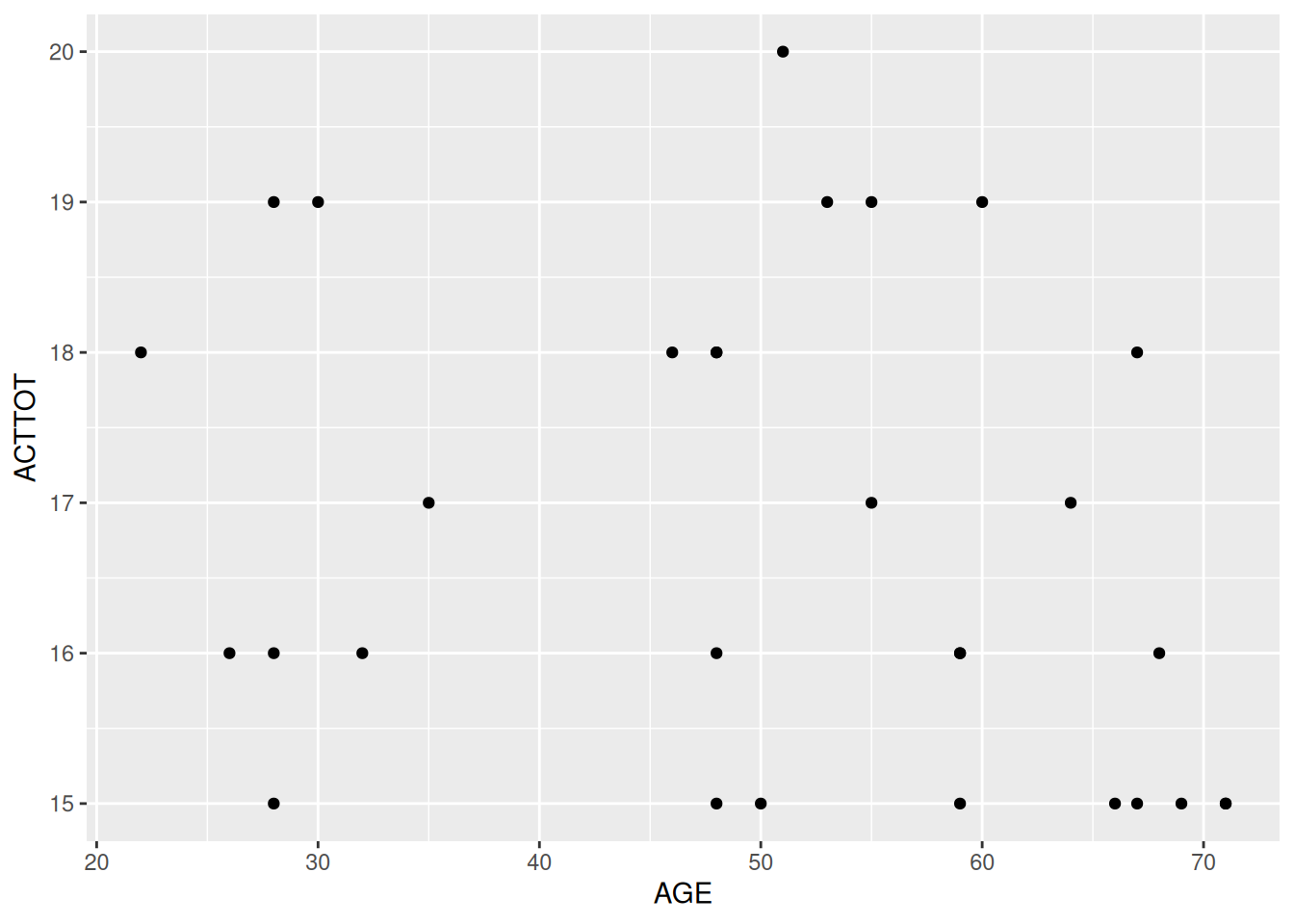
By default, qplot chooses the most appropriate geom for us based on data types. A single continuous variable is displayed as a histogram, bivariate continuous data are displayed as a scatter plot. As you can see in the example below, it also makes the assumption that we are mapping variables to aesthetics and so the `aes’ function is no longer required.
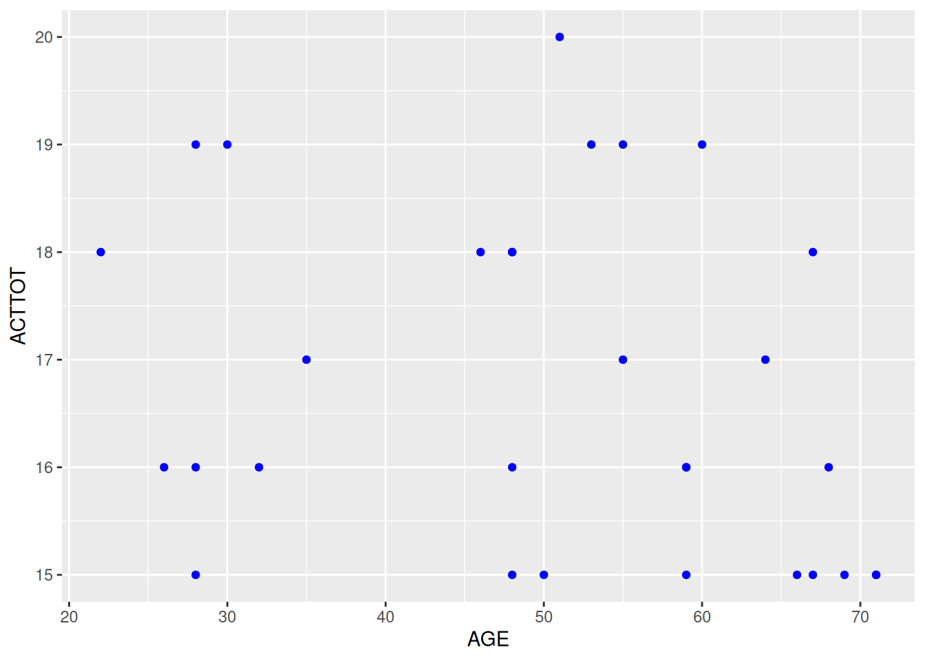
# Create some baseline databl_data <- act_full %>%filter(VISITNUM ==20)# Quickly plot itqplot(data = bl_data, x = AGE, y = ACTTOT)
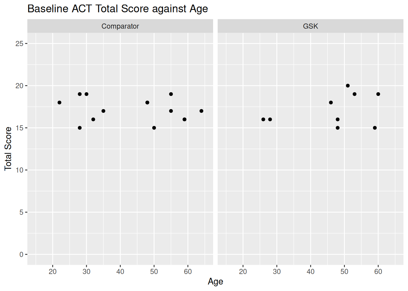
Other layers, such as facets, titles and axis information can be passed to qplot directly in a single call.
qplot(data = bl_data, x = AGE, y = ACTTOT, main ="Baseline ACT Total Score against Age",xlab ="Age", ylab ="Total Score",xlim =c(15, 65), ylim =c(0, 25),facets =~ ARM)
9.2.1 Changing the geom with qplot
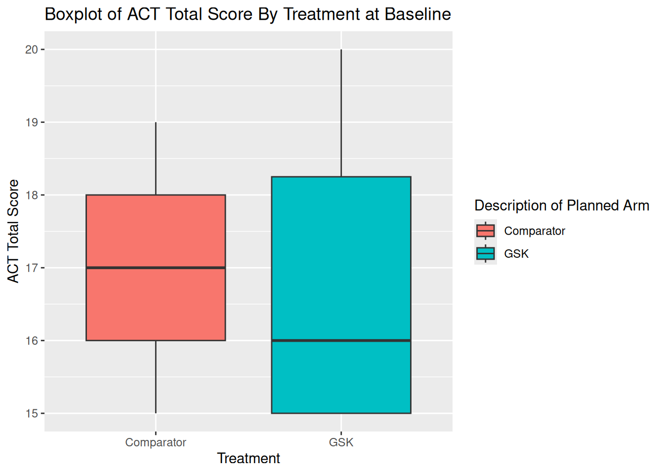
It is also possible to change the default geom when using qplot. In order to do so we use the geom argument. The geom argument takes character string, and expects the name of a geom function, without the “geom_” prefix. For example, geom_boxplot becomes geom = "boxplot".
qplot(data = bl_data, x = ARM, y = ACTTOT, fill = ARM,geom ="boxplot",main ="Boxplot of ACT Total Score By Treatment at Baseline",xlab ="Treatment", ylab ="ACT Total Score")
9.2.2 Drawbacks of qplot
Not having to write aes when refering to variables comes at a price. If we wish to simply colour everything blue then we need to use the I function to do so. The same applies for any aesthetic that is not mapped from the data.
# Make it blue!qplot(data = bl_data, x = AGE, y = ACTTOT, colour =I("blue"))
Controlling how information is passed between layers can also be a challenge when using qplot. Although additional layers can still be used to enhance any quick plot, the qplot function is best used when working with a single dataset and a single geom.
Finally, it is worth noting that the flexibility of the functionality was reduced in a recent ggplot update. Hadley Wickham has also recently restructured his own materials to reduce the function’s “airtime”. The future may therefore not be bright for qplot.
9.3 EXERCISE
Create a scatter plot of Change from baseline in ACT Total Score at Week 24 against baseline using qplot
Vary the colour by treatment
Vary the shape of the point in order to highlight the Week 24 responders
Use [geom_]jitter instead of [geom_]point.
Create a density plot of age with the demography data (dm) using qplot
Shade the area by treatment
Adjust the transparency so that the full curves can be seen for both treatments
Extra
Create an individual time profile plot (i.e. panel by USUBJID) of the change from baseline in ACT Total Score over time, from baseline to week 24 (excluding EW)
Colour by treatment
Move the legend to the bottom of the graph and ensure that the two treatments are side by side in the legend
Create your own theme which has no major or minor grid lines and for which the strip header text is always in bold. Test this theme on the graphic from question 3.
If you notice an issue, have suggestions for improvements, or want to view the source code, you can find it on GitHub.