ggplot(data = dm,
       aes(x = AGE)) +
  geom_histogram(binwidth = 10, fill = "lightblue") +
  facet_grid(. ~ SEX)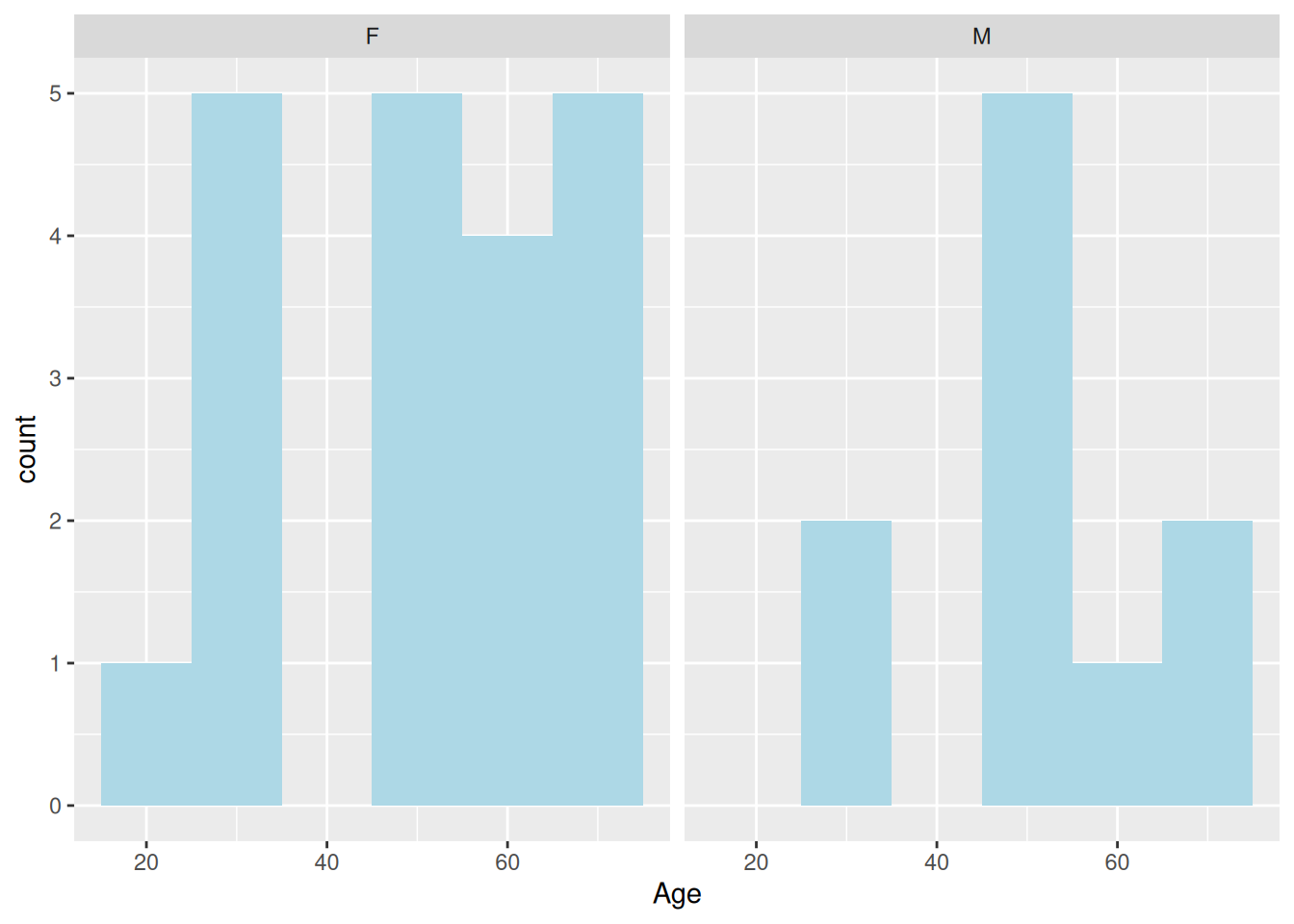
One of the most distinguishing features of the original S-PLUS trellis library was the ability to compare graphics levels of factor variables in separate plots as opposed to using colour, shape or size to distinguish between the levels. In S-PLUS this was known as trellising and was later modified for R and re-branded latticing in R’s lattice package. In ggplot2 it is called faceting.
We create our panelled plots either by adding a facet_grid or a facet_wrap layer. We start with facet_grid.
The facet_grid function creates a panelled plot where panels comparing a variable are either stacked vertically or horizontally. We can control whether the panels are stacked vertically or horizontally by placing the variable name to the right or left of a ~ (tilde) respectively. For example, here are age histograms for females and males plotted side by side.
ggplot(data = dm,
aes(x = AGE)) +
geom_histogram(binwidth = 10, fill = "lightblue") +
facet_grid(. ~ SEX)
Note the use of the .. We must ensure that either a variable or the . is specified on either side of the tilde. If we only wish to panel by a single variable we place a . on the other side. In order to stack the panels vertically we would swap the . and the SEX variable around.
We can panel by as many variables as we wish to. Here we panel by sex and treatment.
ggplot(data = dm,
       aes(x = AGE)) +
  geom_histogram(binwidth = 5, fill = "lightblue") +
  facet_grid(ARM ~ SEX)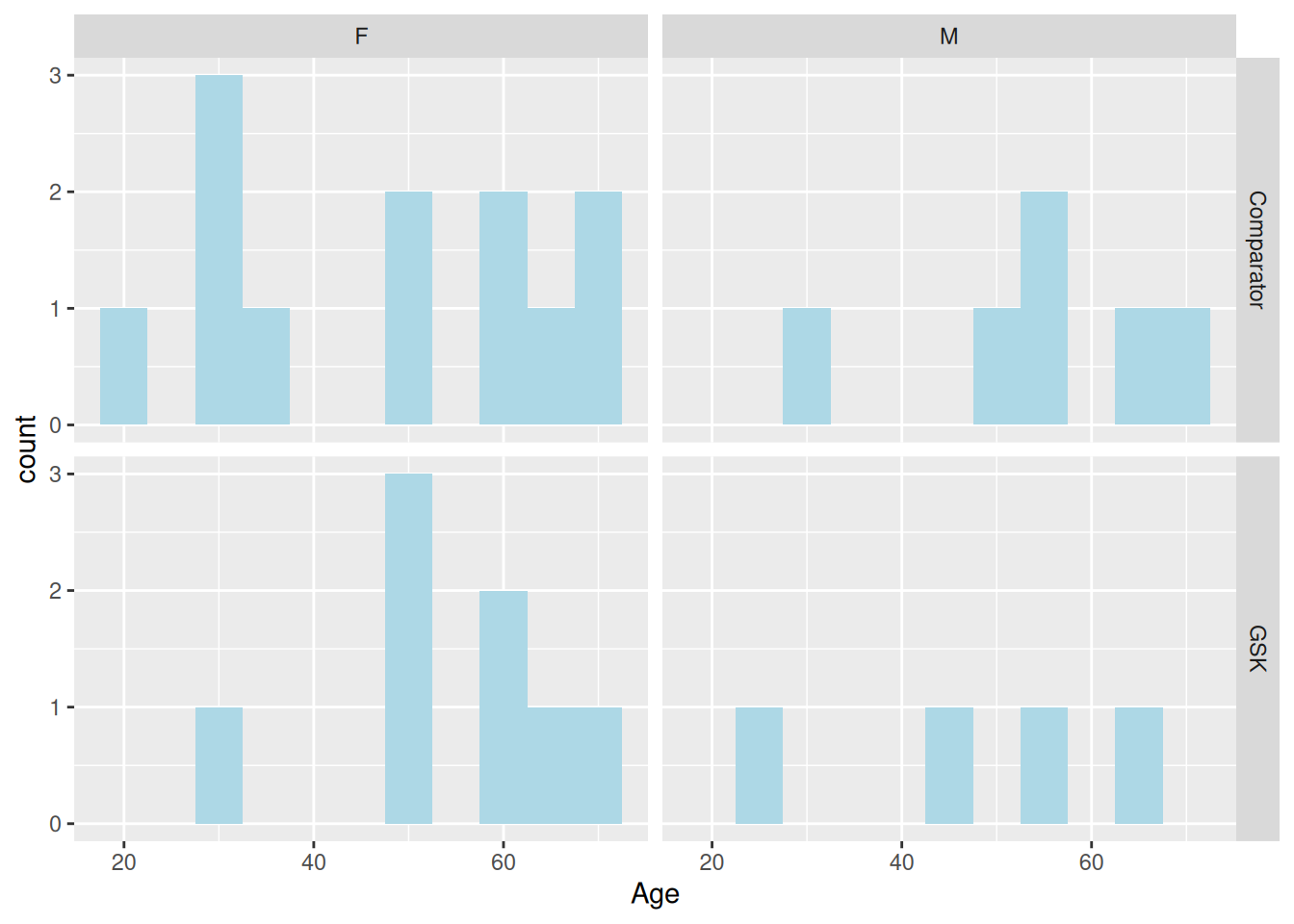
Here we use a + to align all four panels vertically.
ggplot(data = dm,
       aes(x = AGE)) +
  geom_histogram(binwidth = 5, fill = "lightblue") +
  facet_grid(ARM + SEX ~ .)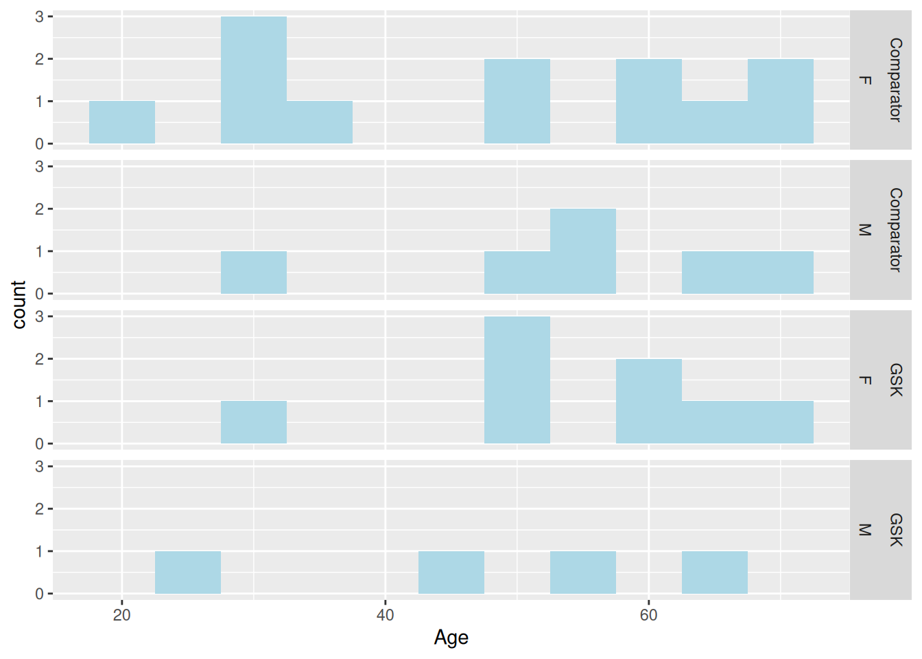
When a variable has multiple levels, forcing each of the panels to stack in one direction or another may not be practical. The facet_wrap is an alternative to facet_grid that fills the space as best it can. We are still required to use the tilde to specify variable, however the left-hand side has no meaning. We may therefore leave it blank and list all variables to the right of the tilde, still separating each one with a +.
ggplot(data = theoph,
       aes(x = TIME, y = CONC, group = SUBJID)) +
  geom_line() +
  facet_wrap(~ DOSE)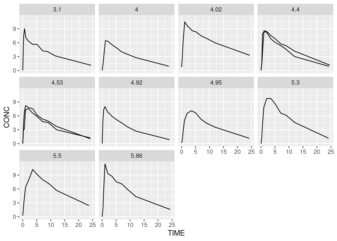
By default, only the levels are shown in the ‘strip header’. If the levels are non-informative such as ‘Y’ and ‘N’ then it can be helpful to include the original variable as well. This is achieved via the labeller argument. We can write our own labelling functions but it’s usually simpler to use the unbuilt label_both function.
ggplot(data = theoph,
       aes(x = TIME, y = CONC, group = SUBJID)) +
  geom_line() +
  facet_wrap(~ DOSE, labeller = label_both)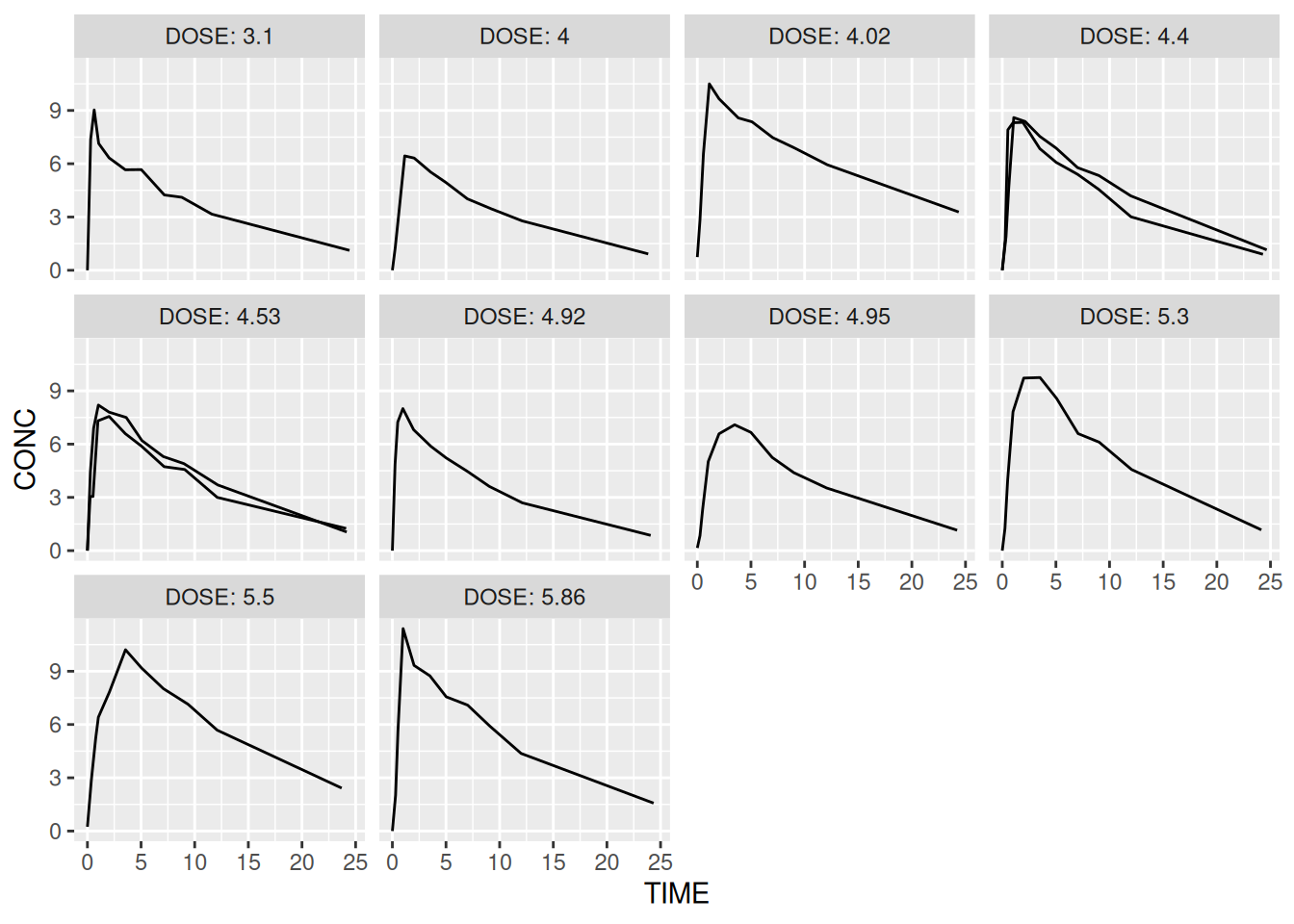
There are several additional arguments to the facet functions including the ability to free scale one or both of the axes.
Later we will look at how to control styling elements such as the orientation of text in the panel headers.
ACTTOT variable and panel this by visit