pk <- tibble(SUBJID = as.character(rep(1:2, each = 5)),
             TIME = rep(c(0, 1, 6, 12, 24), 2),
CONC = c(0, 10, 7, 6, 3, 0, 8, 6, 3, 1))3.1 Background and Reading
The ggplot2 package is Hadley Wickham’s implementation of Leland Wilkinson’s The Grammar of Graphics book. Hadley Wickham initially produced a white paper explaining his interpretation and implementation in R, A Layered Grammar of Graphics. Since then Hadley has published (and re-published) his own book, ggplot2: Elegant Graphics for Data Analysis.
3.2 Key Principles of A Layered Grammar of Graphics
We don’t need to read any of the above in order to be able to use ggplot2 but a basic understanding of the principles can help our understanding. We will loosely cover these principles throughout the course but the first key concept is that data are structured such that each variable is a column and each row is an observation. Today, Hadley Wickham refers to this as “tidy” data.
The second key concept is a little less straightforward to understand. This is the concept of layered graphics. The idea is that a plot is made up of various layers. Each layer describes how various features of the plot are to be drawn. One of the most important layers is the mapping of data to what Hadley describes as the aesthetics. Under Hadley’s definition, aesthetics refer not only to colour, shape and size but also the x and y coordinates. Additional layers such as the geom[etric] layers control how these aesthetics are presented (for example what type of plot is actually drawn).
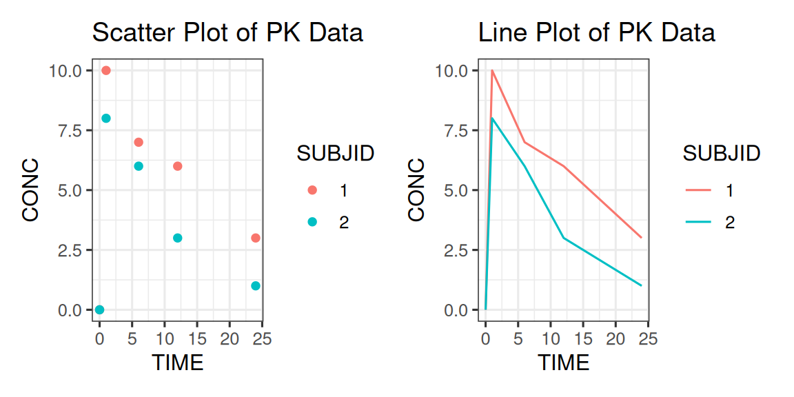
3.2.1 Aesthetic Mappings Example
Consider a plot of drug concentrations over time, we map concentration to the y-axis and time to the x-axis. This is the same mapping, regardless of whether we draw a scatter plot or a line plot (or even box plots at each time point). The mapping of ‘concentration’ to ‘y’ and ‘time’ to ‘x’ is an aesthetic mapping. Other aesthetic mappings might involve mapping a variable, such as the drug dose or subject, to colour or line type. The type of plot (point or line) is controlled separately via a geometric layer. Let’s see that in practice using an example similar to that in Hadley’s original paper.
The tables and code below provide a visual representation of a possible mapping of some fabricated PK data. The first table shows the original data.
| SUBJID | TIME | CONC |
|---|---|---|
| 1 | 0 | 0 |
| 1 | 1 | 10 |
| 1 | 6 | 7 |
| 1 | 12 | 6 |
| 1 | 24 | 3 |
| 2 | 0 | 0 |
| 2 | 1 | 8 |
| 2 | 6 | 6 |
| 2 | 12 | 3 |
| 2 | 24 | 1 |
We map variables to aesthetics as follows:
| colour | x | y |
|---|---|---|
| red | 0 | 0 |
| red | 1 | 10 |
| red | 6 | 7 |
| red | 12 | 6 |
| red | 24 | 3 |
| blue | 0 | 0 |
| blue | 1 | 8 |
| blue | 6 | 6 |
| blue | 12 | 3 |
| blue | 24 | 1 |
Having defined our mapping, we can create various different plot types.
Later on in the course we will look at how the aesthetic mappings are controlled by scale and how we can modify our geometric mappings using statistical transformations, stats.
Other key concepts discussed in the course are facets (panelled plots) and the coordinate system itself, coord.